Picking the right BI tool isn't just a tech purchase; it's a strategic move that shapes your company's entire data culture. This decision comes down to one thing: finding the platform that can turn your raw numbers into clear, actionable insights. Get it right, and you'll drive smarter operations and gain a real competitive edge.
Let's break down how the top contenders—Power BI, Tableau, and Looker—stack up on practical, real-world criteria.
Why a Business Intelligence Tools Comparison Matters
Choosing your business intelligence (BI) software is a foundational step in becoming a truly data-driven organization. The right tool doesn't just spit out charts. It tells a story, uncovers hidden trends, and gives everyone on your team the confidence to make better decisions.
A careful comparison ensures you're investing in a solution that actually fits your business goals, your current tech stack, and the skill level of your people. The market is exploding for a reason: the global BI software market was valued at USD 41.74 billion in 2024 and is on track to hit USD 151.26 billion by 2034, largely thanks to new AI and machine learning features.

Key Contenders at a Glance
Before we get into the nitty-gritty, it helps to understand what makes each of these tools unique. I like to think of them as different specialists you'd hire for different jobs.
| BI Tool | Core Strength | Ideal For |
|---|---|---|
| Microsoft Power BI | Seamless Microsoft Ecosystem Integration | Organizations already running on Azure, Office 365, and SQL Server. |
| Tableau | Best-in-Class Data Visualization & Storytelling | Teams who need to visually explore complex data and build beautiful, compelling reports. |
| Looker (Google) | Governed Data Modeling & Single Source of Truth | Companies that need strict data governance and consistent metrics across every department. |
This table makes it pretty clear: there's no single "best" tool. There's only the best fit for your specific situation. The whole point is to match a platform's strengths to your unique business challenges.
Ultimately, the goal of comparing business intelligence tools is to empower smarter decision-making and drive tangible business results through improved processes. To understand the various approaches, refer to articles on these core process improvement techniques.
A solid BI implementation is about more than just slick dashboards; it's about making your operations run smoother. For example, many businesses find huge efficiency gains when they connect their BI insights to automation workflows. Understanding the https://bankstatementconvertpdf.com/business-process-automation-benefits/ can show you how a BI tool can deliver an even bigger ROI by pinpointing exactly where to optimize. The platform you choose will fundamentally change how your company uses its most valuable asset: its data.
How to Evaluate BI Software for Your Business
Picking the right business intelligence tool is more than just ticking off features on a list. To do a proper business intelligence tools comparison, you need a framework that matches what the software can do with what your business actually needs. It’s all about finding a platform that doesn’t just show you data but fits right into how you already work.
The first step? Look at the tech you're already using. Before you get dazzled by flashy dashboards, you have to figure out how a new tool will plug into your current systems. This is non-negotiable if you want to avoid creating data silos and ensure the whole process goes smoothly from day one.

Data Connectivity and Integration
A BI tool is only as good as the data it can get its hands on. The very first thing to check is how well it connects to your different data sources—cloud warehouses, on-premise databases, or third-party apps like Salesforce or Google Analytics. Look for built-in, native connectors for your most critical platforms; this will save you from a world of headache trying to build custom integrations.
This is a big deal for financial data, which tends to be scattered all over the place. For example, if your team works with a lot of bank statements, you need a BI tool that can pull that information in without a fuss. Many businesses use specialized financial data extraction tools to get the data ready before it even hits the BI platform.
Visualization and Reporting Flexibility
Once the data is flowing, the tool needs to help your team turn it into a story that makes sense. We're talking about more than just basic bar charts. See how flexible the platform is when it comes to building custom visuals, interactive dashboards, and reports that can be scheduled and sent out automatically. The goal is to get clear answers to specific business questions.
You're looking for that sweet spot between power and simplicity. Can your marketing manager quickly whip up a dashboard showing campaign results without calling IT? At the same time, can a data analyst dive deep and build a complex, multi-layered visualization to spot hidden trends? The tool needs to serve both.
The best BI tools provide a flexible canvas for both technical and non-technical users. They should enable anyone to move from raw data to actionable insight with minimal friction, turning curiosity into clear answers.
Ease of Use vs. Customization Depth
There’s often a trade-off in BI software: do you want something that's incredibly easy to use or something that’s endlessly customizable? Tools like Power BI are famous for their intuitive drag-and-drop interfaces that are perfect for business users. On the other hand, some platforms offer deep customization that data scientists and developers love, but they come with a much steeper learning curve.
Think about who will actually be using this tool every day. Is it for a small, dedicated analytics team or for people across every department? The right answer depends entirely on your user base. A platform that strikes the right balance will get used by everyone, not just a select few.
Power BI vs. Tableau vs. Looker: A Deep Dive
Picking the right business intelligence platform isn't about ticking boxes on a feature list. It's about finding a tool whose philosophy aligns with your company's data culture and tech stack. In this comparison, we're going to get past the marketing fluff and look at how Microsoft Power BI, Tableau, and Looker (now Google Cloud) actually work in the real world. Each of these heavyweights has a distinct personality, making them a great fit for some companies and a frustrating one for others.
The market certainly reflects this. Microsoft Power BI is a juggernaut, holding over 30% of the BI market share as of 2021 with more than 30 million active monthly users. Tableau is no slouch either, commanding roughly 16.99% market share in the same year, with its software in use at over 100,000 companies. You can dig into more adoption stats over at scoop.market.us.
This infographic gives a great visual breakdown of what companies prioritize when they're in the market for a BI tool.
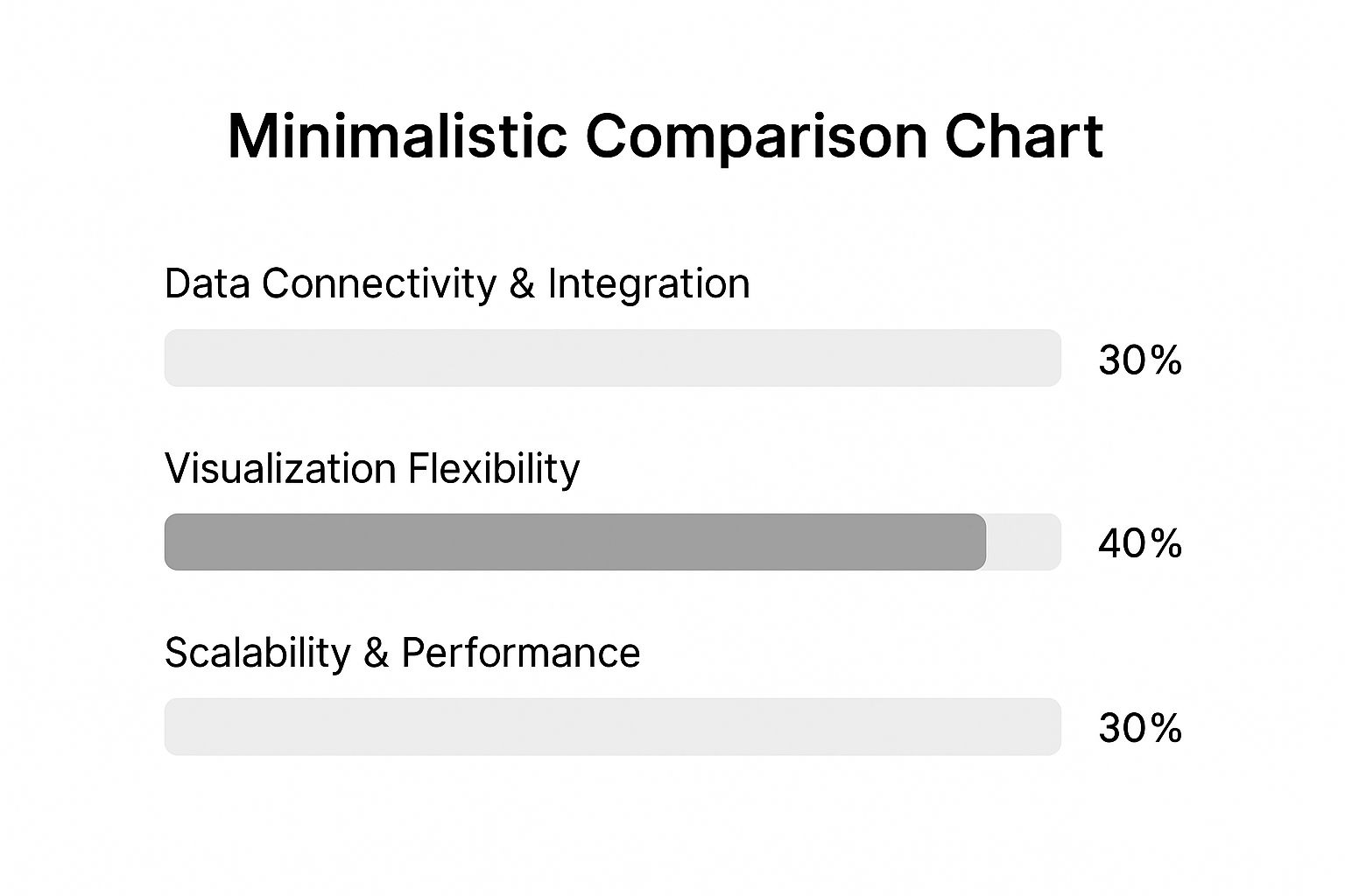
As you can see, while everything matters, Visualization Flexibility often tips the scales. It's the most tangible part of the experience—how users actually see and interact with the data.
Microsoft Power BI: The Ecosystem Champion
Power BI's secret weapon is its deep, native integration with the Microsoft ecosystem. If your company already runs on Azure, Office 365, and SQL Server, bringing in Power BI feels less like a major new tool adoption and more like activating a feature you already had. This makes getting started incredibly smooth, both from a technical and a financial standpoint.
The interface is instantly familiar to anyone who's spent time in Excel, which is a massive advantage. This design choice empowers business users to jump in and create useful reports without weeks of training, helping build a self-service analytics culture that doesn't constantly lean on the IT department.
Where Power BI Really Shines:
- Rapid Deployment: For teams already on Microsoft 365, you can be up and running in hours. Connecting to an Excel file or a SharePoint list is practically instantaneous.
- Cost-Effectiveness: With a free desktop version and a very affordable Pro license, it’s an easy sell for small businesses or departments trying to get a BI initiative off the ground.
- Powerful Data Modeling: Under the hood, the Power Query and DAX (Data Analysis Expressions) engine is seriously robust, giving you the tools to clean, shape, and model even messy data.
Of course, that tight integration can also be a weakness. While it connects to plenty of non-Microsoft sources, the experience just isn't as seamless. Sharing reports with people outside your Microsoft-based organization can sometimes feel a bit clunky.
Power BI’s entire strategy is built on making business intelligence a natural extension of the software millions of people already use daily. It's all about accessibility and easy integration, sometimes at the expense of the highly specialized visualization features its competitors are known for.
Tableau: The Visualization Powerhouse
For years, Tableau has built its stellar reputation on one thing: jaw-dropping data visualization. Its entire platform is engineered to help people "see and understand data" by creating beautiful, interactive, and deeply insightful dashboards. Where another tool might give you a standard bar chart, Tableau lets you build a multi-layered visual story that practically begs to be explored.
This intense focus on the visual makes it a go-to tool for data analysts, marketing professionals, and anyone who needs to communicate complex findings to a wider audience. It's also data-source agnostic, happily connecting to just about anything without being picky about your data warehouse, which gives you a lot of freedom.
Tableau's Key Strengths:
- Unmatched Visual Flexibility: Its drag-and-drop interface gives you near-limitless control. If you can imagine a visualization—from intricate Sankey diagrams to complex geospatial maps—you can probably build it in Tableau.
- A Massive, Active Community: The Tableau user community is one of the most vibrant out there. You’ll find an endless supply of tutorials, dashboard templates, and forums full of people eager to help you solve a problem.
- Built for Exploration: The tool is designed to help you answer the "why" behind the data. Its fluid, interactive filters and drill-down capabilities turn data discovery into an engaging process.
All that power comes with a price, though—both in licensing costs and a steeper learning curve for its most advanced features. Anyone can make a basic chart, but mastering Tableau to create truly world-class dashboards takes real dedication.
Looker: The Governance and Modeling Maverick
Looker, now a core part of Google Cloud, plays a completely different game. Instead of leading with visualization, Looker’s entire philosophy is built on its powerful, centralized data modeling layer, LookML. This is where Looker really separates itself from the pack.
Using LookML, your data team defines every business metric, calculation, and data relationship in a single, version-controlled place. This creates a "single source of truth" that governs every single report and dashboard built in Looker. The result? When someone asks, "What's our monthly recurring revenue?" they get the exact same answer, every single time, no matter which department they're in.
Looker’s Unique Advantages:
- Centralized Governance: By defining all the logic in LookML, Looker puts an end to data chaos. Metrics are defined once and reused everywhere, ensuring everyone is speaking the same language.
- Developer-Friendly and Embeddable: Looker was built API-first. This makes it the top choice for companies wanting to embed analytics directly into their own products or build custom data applications for their customers.
- Completely Browser-Based: As a cloud-native tool, the entire platform runs in your browser. There’s no desktop software to install, which dramatically simplifies deployment and ongoing maintenance.
This model-centric approach requires a serious upfront investment from a technical team to build out the LookML models. It isn't a tool you hand to a business user with a spreadsheet. Looker is an enterprise-grade platform for organizations that value data governance, consistency, and scalability above all else.
At-a-Glance Feature Comparison of Top BI Tools
To quickly see how these platforms stack up, this table provides a side-by-side view of their core attributes. It's a great way to quickly narrow down which tool might align best with your team's skills and business goals.
| Feature/Criteria | Microsoft Power BI | Tableau | Looker (Google Cloud) |
|---|---|---|---|
| Primary Strength | Seamless integration with Microsoft ecosystem and ease of use for business users. | Best-in-class interactive data visualization and storytelling. | Centralized data modeling (LookML) for governance and consistency. |
| Ideal User | Business analysts and general users, especially within a Microsoft-heavy company. | Data analysts, data scientists, and anyone focused on deep data exploration. | Data teams and developers building a governed, scalable data platform. |
| Ease of Use | Very high, especially for users familiar with Excel. Low barrier to entry. | Moderate. Easy for basic charts, but a steep curve for advanced features. | Low for business users (it's simple to explore), but high for the data team setting up LookML. |
| Data Governance | Good. Relies on creating and sharing certified datasets and dataflows. | Fair. Governance is more of a manual process based on best practices. | Excellent. Governance is built into the core of the product via LookML. |
| Cost | Low. Very accessible pricing, with a free desktop version available. | High. Tends to be one of the more expensive options, especially at scale. | High. Enterprise-focused pricing that requires custom quoting. |
| Deployment | Desktop application (Windows-only) and a cloud service (Power BI Service). | Desktop application, server, and a fully-hosted cloud version (Tableau Cloud). | 100% browser-based and cloud-native. No desktop software required. |
Ultimately, this table highlights the core trade-offs. Power BI offers accessibility, Tableau provides visual depth, and Looker delivers unbreakable governance.
Which Tool for Which Job?
Let’s put this all into a real-world context. Here's a look at which tool I'd recommend for a few common business scenarios.
-
Scenario: A small marketing team needs to quickly visualize campaign results from Google Analytics and a few spreadsheets.
- Recommendation: Power BI. It’s an excellent fit. The low cost and user-friendly interface are perfect for this kind of rapid, ad-hoc analysis without needing a dedicated data person. Tableau is also great here, but the higher price might be a deal-breaker. Looker would be total overkill.
-
Scenario: An enterprise needs to provide consistent, governed sales metrics to hundreds of users across the company.
- Recommendation: Looker. This is exactly what Looker was designed for. The centralized LookML model ensures every single person sees the same, correct number for "revenue" or "customer churn." Power BI could handle this with disciplined setup, but it’s not its core strength.
-
Scenario: A data journalist needs to create a highly custom, interactive visualization for a public-facing news article.
- Recommendation: Tableau. It’s the undisputed champion for this kind of work. Tableau Public and the platform's advanced design capabilities make it the industry standard for data storytelling. Looker's embedding is strong, but it's geared more toward business dashboards.
The final decision really comes down to your organization's priorities. If you live and breathe Microsoft and want to get BI into the hands of business users fast, Power BI is the obvious choice. If your main goal is to tell powerful, compelling stories with your data, Tableau is still king. And if you're serious about building a scalable, governed data culture where everyone trusts the numbers, Looker provides an unmatched framework.
Understanding the True Cost of BI Platforms
When you're shopping for a BI tool, looking at the sticker price is just scratching the surface. To make a smart investment, you have to dig deeper and calculate the total cost of ownership (TCO). This is a non-negotiable step in any serious business intelligence tools comparison.
Too many companies get blindsided when they realize the software license is just a small piece of the puzzle. The real, and often substantial, costs pop up during implementation, integration, and day-to-day maintenance.

Unpacking Different Pricing Models
The big players in the BI space don't all price their products the same way. Each model is designed for different types of teams and scales of business, so knowing the difference is the first step to building an accurate budget.
- User-Based Subscriptions (Power BI): This is the classic, pay-per-seat model. You pay a flat fee for each user, every month. It’s predictable and simple, which makes it a great fit for smaller teams or companies just dipping their toes into BI.
- Role-Based Tiers (Tableau): Tableau gets a bit more specific. It prices its licenses based on what a user does. "Creators" who build the dashboards and reports cost the most, while "Viewers" who just consume that information are much cheaper. This can save you a lot of money if you have a large audience of casual users.
- Platform-Based Pricing (Looker): Looker often goes with custom pricing tied to how the platform is used, how much data you're pushing through it, and the mix of internal versus external users. This approach is common for large, enterprise-level setups where the tool is embedded into other software or serves a wide, diverse audience.
The Hidden Costs You Cannot Ignore
Frankly, the most significant expenses of any BI rollout are rarely the ones you see on the pricing page. These indirect costs can easily double or even triple your initial budget if you aren't ready for them.
The true cost of a BI platform isn’t what you pay for the license; it’s the total investment required to make it deliver real business value. Ignoring implementation, training, and administration costs is the most common budgeting mistake.
Here are the hidden costs you absolutely have to account for:
- Implementation Services: Unless you have a team of seasoned BI experts in-house, you'll probably need to hire consultants or pay for the vendor’s professional services. This is essential to get the platform configured correctly and can run anywhere from a few thousand to tens of thousands of dollars.
- Data Integration and ETL: Your BI tool is only as good as the data it receives. The process of extracting, transforming, and loading (ETL) that data from all your different systems can be a massive undertaking with significant costs. It's smart to look at the entire data stack feeding your BI tool, as you can often find savings when you explore cost-effective alternatives for your data pipeline infrastructure.
- Training and User Adoption: A powerful tool that no one knows how to use is just expensive shelfware. You have to budget for proper training sessions, workshops, and ongoing internal support to make sure your team can actually get value from the platform.
- Ongoing Administration: Someone has to be in charge of managing user permissions, keeping an eye on performance, and handling system updates. This administrative overhead is a constant operational cost, whether it’s baked into an IT pro's salary or you hire a dedicated BI admin. For complex scenarios like managing financial data, this requires specialized knowledge, which is related to the growing use of OCR in banking.
The spending trends in the BI market back this up. Over the next 12 months, global spending on BI software is expected to hit about USD 72.1 billion. A whopping 53% of that will come from companies with revenues over USD 5 billion. While Power BI has the most customers, Looker brings in a much higher share of the total spend, which points to larger, more complex enterprise deals that factor in these extensive implementation and support costs. This shows that the biggest companies know the real investment goes far beyond just the software license.
Which BI Tool Wins for Your Use Case?
Comparing business intelligence tools on paper will only get you so far. The real test is how they perform when you throw a genuine business problem at them. The best tool isn't the one with the longest feature list; it's the one that solves your specific challenge in the most effective way.
So, let's step away from the spec sheets and look at three real-world scenarios. We'll see how Tableau, Looker, and Power BI each step up to become the clear winner in their element. These examples will help you picture how their unique strengths deliver tangible results.
Tableau for E-commerce Customer Journey Optimization
Picture an online retailer trying to figure out why so many shoppers are abandoning their carts. They're sitting on a mountain of data from Google Analytics, their CRM, and their sales platform, but it’s all siloed. The mission is to stitch together the complete customer journey—from the first ad click to the final purchase—to pinpoint exactly where things are going wrong.
This is a job tailor-made for Tableau. Its superpower is its ability to connect to wildly different data sources and blend them into a single, visually compelling narrative. An analyst could jump into Tableau and:
- Map the sales funnel visually: Build a Sankey diagram that clearly shows the flow of users from the homepage to product pages, the cart, and checkout.
- Spot the drop-off points: Immediately see the biggest leaks in the funnel, like a clunky shipping options page that’s causing users to bail.
- Segment by user behavior: Drill down to compare the paths of first-time visitors against returning customers, revealing completely different pain points for each group.
For an e-commerce business, visualizing the customer journey isn't just a data exercise—it's a direct line to boosting revenue. Tableau nails this by transforming complex, multi-source user data into an interactive story that marketing and product teams can actually use.
Looker for SaaS Embedded Analytics
Now, let's switch gears to a B2B SaaS company. Their goal is to offer customers in-app dashboards that display their own usage data. The big challenge here is twofold: ensuring every customer sees only their data, and making sure that key metrics like "Active Users" or "Feature Adoption" are defined and calculated the exact same way for everyone. Consistency is everything.
This is where Looker absolutely shines. Its entire architecture, built on the LookML data modeling layer, was practically designed for this. With Looker, the SaaS company’s data team can:
- Define metrics once, centrally: They can create a single, governed definition for every important metric within LookML. This guarantees that every customer dashboard is pulling from the same source of truth.
- Embed dashboards securely: Using Looker's powerful API, they can embed white-labeled analytics right into their application. Row-level security automatically handles filtering the data so each customer only sees their own information.
- Empower customer self-service: They can even let customers safely explore their own data within the embedded dashboard, with zero risk of them stumbling upon another company’s sensitive info.
Looker’s governance-first philosophy makes it the go-to for delivering scalable, secure, and rock-solid embedded analytics. While other tools can embed dashboards, Looker's model-centric approach is truly purpose-built for it.
Power BI for Manufacturing Supply Chain Efficiency
Finally, consider a manufacturing firm that needs a real-time pulse on its supply chain. They have to monitor inventory, track shipments from various logistics partners, and watch production line output. Critically, most of this operational data is already living within the Microsoft ecosystem, like Azure SQL and a slew of Excel files.
For this company, Power BI is the obvious and most potent choice. Its native integration with other Microsoft products makes deployment incredibly fast. The firm can:
- Connect to data in seconds: Use out-of-the-box connectors to pull data from Azure, SharePoint, and Excel files with just a few clicks. No complex setup is needed.
- Build live dashboards: Create dashboards that refresh automatically to show real-time production numbers and inventory levels, helping managers spot bottlenecks the moment they occur.
- Set up automated alerts: Leverage Power Automate to trigger a notification when inventory drops below a critical threshold or a key shipment is delayed.
For any business already invested in the Microsoft stack, Power BI feels less like a separate tool and more like a natural extension of their existing world. This tight integration removes friction and dramatically speeds up the time it takes to get from raw data to actionable insight. If you're dealing with similarly complex data streams in finance, you might find our guide on the best financial reporting software useful.
So, How Do You Make the Final Call on a BI Tool?
When you’ve done all the research, making that final decision really comes down to one thing: matching a tool’s core strengths to your company's actual needs. Forget the endless feature lists for a moment. The best choice depends on the size of your team, their technical chops, and where you're headed with your data strategy. There's no magical "best" tool out there—only the one that’s the right fit for you.
To get there, you need to look at your business from a few different angles. A nimble startup has completely different priorities than a massive enterprise, and the right BI platform reflects that reality.
Finding the Right Tool for Your Team
To cut through the marketing noise, think about which of these common business scenarios sounds most like your own. This approach helps zero in on the most practical option.
-
The Agile Startup: For small, fast-moving teams, Microsoft Power BI is almost always the answer. Its low cost of entry and familiar Excel-like feel mean you can get value right away without a huge investment. If you need to spin up a quick dashboard from a spreadsheet, it’s perfect for that kind of rapid analysis.
-
The Mid-Sized Marketing Agency: Here, Tableau usually wins out. Agencies live and die by their ability to tell compelling stories with client data. Tableau’s incredible visualization capabilities let them build beautiful, interactive dashboards that make campaign results and customer insights crystal clear.
-
The Large Enterprise: In a big company, Looker (now part of Google Cloud) is the strategic move. Data governance and consistency are everything at this scale. Looker’s centralized LookML data model acts as a single source of truth, ensuring that sales, finance, and marketing are all working from the same playbook.
Ultimately, your choice of BI tool is less about which one has the longest feature list and more about which one fits your company's data culture. Pick the tool that will actually empower the people using it day in and day out.
Your Final Stakeholder Checklist
Before you sign on the dotted line, get your key stakeholders in a room (or on a call) and run through these last questions. Working through this together ensures your decision is well-supported and built for the long haul.
- Scalability: Will this tool still work for us in five years? Think about both the number of users and the sheer volume of data we expect.
- Adoption: Who is actually going to be using this? Is the tool intuitive for their skill level and does it fit into how they already work?
- Integration: How well does this plug into our current tech stack? Does it have out-of-the-box connectors for our most critical systems?
- Governance: What's our plan for keeping data accurate and consistent across the whole organization with this platform?
- Total Cost of Ownership: Have we really thought through all the costs? This includes the initial price tag plus training, implementation, and ongoing admin work.
Got Questions About BI Tools? We've Got Answers.
When you're deep in the weeds comparing business intelligence tools, a few practical questions always seem to pop up. Let's tackle some of the most common ones that come up right before you pull the trigger on a decision.
How Hard Is It to Switch BI Tools Later On?
The short answer? Yes, you can switch, but it’s a massive headache you want to avoid at all costs. Think of it less like swapping out a piece of software and more like a full-scale operational transplant.
Migrating means you're rebuilding every single dashboard and report from scratch. You'll also have to retrain your entire team and completely re-engineer the data connections. It's a costly, disruptive process that can bring your reporting to a standstill.
The sheer pain of switching BI tools is why a thorough, honest evaluation upfront is so critical. You're not just picking a tool for today's problems; you're choosing a data partner for the long haul.
What’s the Real Difference Between BI and Data Analytics?
This question comes up a lot. At its core, business intelligence (BI) is all about descriptive analytics. It uses your past and present data to tell you what happened and what’s happening right now. Think of it as your business's real-time scoreboard, helping you monitor performance and make daily operational calls.
Data analytics is the bigger umbrella. It includes BI, but it also goes much further:
- Predictive Analytics: This is your crystal ball. It uses statistical models to answer, "What's likely to happen next?"
- Prescriptive Analytics: This is your strategic advisor. It takes the predictions and recommends actions by answering, "What should we do about it?"
So, BI gives you the essential "where are we?" context, while the broader field of data analytics helps you figure out where you're going and the best way to get there.
How Long Does It Actually Take to Implement a BI Tool?
This is the classic "it depends" answer, but for good reason. The timeline can swing wildly. A small team connecting Power BI to a handful of clean spreadsheets could genuinely be up and running in a few weeks.
On the other end of the spectrum, a large enterprise rolling out Looker across multiple departments with strict data governance rules is looking at a 6 to 12-month project. The timeline gets stretched by things like messy data sources, the number of people who need access, and how much custom work is required.
At Bank Statement Convert PDF, we know that powerful BI starts with clean, usable data. Our tool is designed to handle that crucial first step: turning messy bank statement PDFs into analysis-ready Excel files. Get your data in order and start building smarter dashboards today. Find out more at https://bankstatementconvertpdf.com.